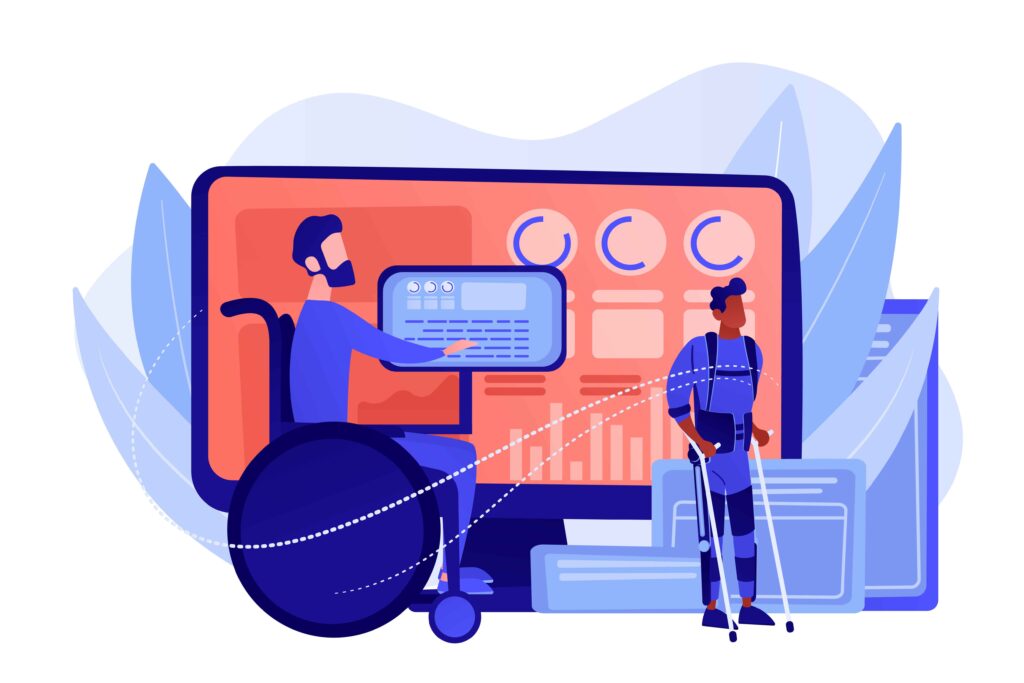
Web accessibility means designing and developing websites that people with auditory, cognitive, neurological, physical, speech, or visual disabilities can use. When websites are properly designed and coded, users with disabilities can perceive, understand, navigate, and interact with the web effectively. Accessibility also benefits people without disabilities, including those using mobile devices, older individuals, and anyone with temporary impairments.
But how can you improve your website’s accessibility when engaging with your target audience? That is what we are going to discuss in this article.
Unfortunately, not many site owners realize this, but headings provide structure to your page for both users and screen readers. A well-organized hierarchy (H1 for main titles, H2 for subtopics, and H3 for details) enables assistive technologies to interpret your content correctly. Images can enrich your content, but can also become barriers if users can’t see them. Alt text (alternative text) describes the purpose or content of an image. Screen readers use it to convey information to visually impaired users. Good alt text should be concise yet meaningful. Instead of writing “image of a woman,” write “woman using a laptop to browse a shopping website.” If the image is purely decorative, you can leave the alt text empty so that screen readers skip it. Adding descriptive alt text also helps search engines understand your visuals, offering an additional SEO advantage. Many users rely on keyboards, not mice, to navigate websites. A fully accessible website should allow users to move through menus, links, and forms using only the Tab, Enter, and Arrow keys. Test your site by navigating it without a mouse. Can you reach every interactive element? Can you see where the focus indicator is? If not, you’ll need to adjust your HTML or CSS. Ensuring a visible focus outline around links and buttons helps users understand where they are on the page. Color contrast plays a critical role in readability. Users with low vision, color blindness, or screen glare issues need clear distinctions between text and background. According to WCAG, the minimum contrast ratio should be 4.5:1 for normal text and 3:1 for large text. You can use online tools like the WebAIM Contrast Checker to test your colors. Beyond contrast, avoid relying on color alone to convey meaning. For example, don’t use only red and green to indicate errors or success; include text or icons as additional cues. Forms are common interaction points but often pose accessibility challenges. Start by ensuring every form field has a clearly associated label. Placeholder text alone is not enough; it disappears once a user starts typing. Use clear instructions and meaningful error messages. If users make a mistake, guide them gently toward fixing it without confusion. For example, instead of “Invalid input,” say “Please enter a valid email address.” Also, group related fields together and provide a logical tab order so users can move through the form intuitively. Videos, podcasts, and other multimedia elements need accessible alternatives. Add captions for users who are deaf or hard of hearing and transcripts for those who prefer reading. For video content, consider providing audio descriptions that narrate key visual elements. These improvements make your content usable in quiet environments, noisy places, and for users with different accessibility needs. If you use auto-playing media, always include the option to pause or stop it. Continuous motion or sound can overwhelm users with sensory sensitivities. Screen readers interpret and vocalize website content for visually impaired users. To ensure your site works well with them, focus on clean, semantic HTML. Use proper elements like <nav>, <main>, <article>, and <button>, so assistive technologies can understand your layout and purpose. Avoid using non-semantic elements like <div> or <span> for interactive functions. If you must, add ARIA (Accessible Rich Internet Applications) attributes to help screen readers interpret your content. For example, aria-label can provide a textual description where one isn’t visible on-screen. Accessibility also extends to different devices and screen sizes. A responsive website adjusts its layout to work on phones, tablets, laptops, and large displays. Users should not need to zoom or scroll excessively to read or interact with content. Ensure that buttons and links are large enough to tap easily, and test your design across multiple devices. Responsive design improves both accessibility and user satisfaction. Not all users can comfortably read your website’s default text size. Allow visitors to adjust font sizes using browser controls or an on-page setting. Avoid locking text size or using absolute units like pixels. Instead, use relative units like em or rem, which scale with user preferences. Readable typography enhances accessibility for users with low vision or reading difficulties, while also making the site more comfortable for everyone. Accessibility isn’t a one-time effort; it’s an ongoing process. Regularly test your site using both automated tools (like Lighthouse, Axe, or WAVE) and manual testing. Automated scans catch code-level issues, but real users can reveal practical problems that those tools miss. Involve people with disabilities in your testing process if possible. Their feedback provides genuine insight into how usable your site truly is. Keep accessibility in mind whenever you update or redesign your website. Search engines reward well-structured, readable content. Accessible websites often load faster, retain users longer, and reduce bounce rates. More importantly, accessibility demonstrates social responsibility. It shows your commitment to inclusivity and equal access for all. This builds trust and strengthens your brand’s reputation. If you’re seeking expert guidance, many companies offering website development services in the UK specialize in creating accessible and user-friendly designs that comply with global accessibility standards. Improving your website’s accessibility is a responsibility and an opportunity. Every improvement you make opens your website to more people, enhances usability, and contributes to a better online experience. By following accessibility best practices, structuring content properly, ensuring a readable design, adding alt text, and making navigation intuitive, you create a space where everyone can engage equally. Accessibility isn’t about limitation; it’s about inclusion, usability, and respect for every visitor who interacts with your website. Moiz Banoori is a seasoned Digital Marketing professional with over eight years of expertise in content creation and digital journalism. At REDLUMB, he spearheads teams to craft impactful SEO strategies that drive online growth and visibility. With a background in journalism, Moiz leverages his expertise in digital marketing to develop effective strategies that boost online visibility and help clients achieve their goals.
Use Proper Heading Structure
Provide Alternative Text For Images
Ensure Keyboard Accessibility
Use Sufficient Color Contrast
Optimize Forms For Accessibility
Make Multimedia Accessible
Design For Screen Readers
Make Your Website Responsive
Offer Adjustable Text Sizes
Test Your Website Regularly
The Broader Benefits Of Accessibility
Final Words